Enhancing the Ordering Experience
The food services landscape is forever changed by the entrance of food aggregators such as UberEATS and Deliveroo. Now that every restaurant is available online for pick up and delivery, there is no room for a subpar experience, at any stage of the user journey.
Certain information has been omitted and obfuscated in this case study. The opinions presented here represent my views alone, not of my current or past employers.
The Role
In late 2016, I joined RFG as a UX Designer to help improve the online ordering experience of two national pizza brands. As the sole UX Designer on the team, I led the effort to understand the customer and improve the usability of their sites.
Customer Research
I conducted surveys and analysed customer feedback to uncover insights and better understand the customers’ motivations and behaviours.
User Journey Mapping
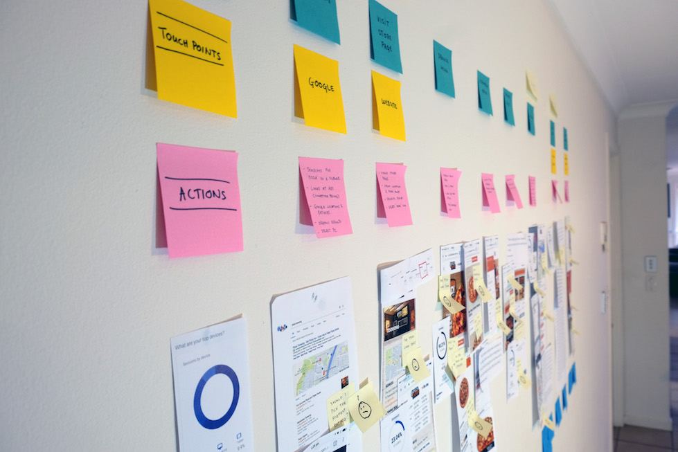
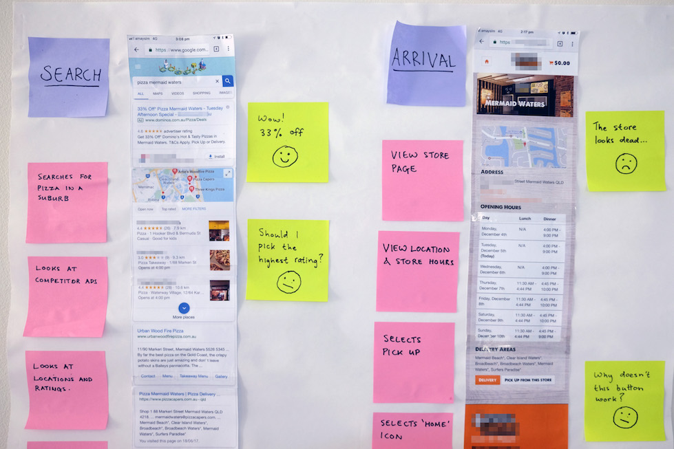
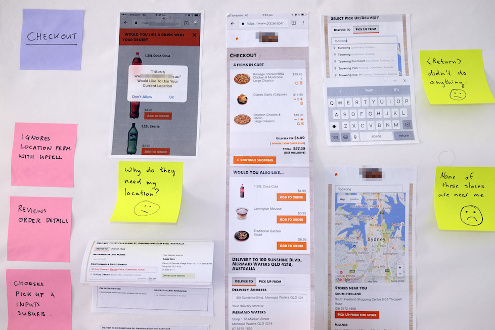
To get buy-in from the business stakeholders, I created proto-personas and illustrated the challenges customers face using user journey mapping.
Information Architecture
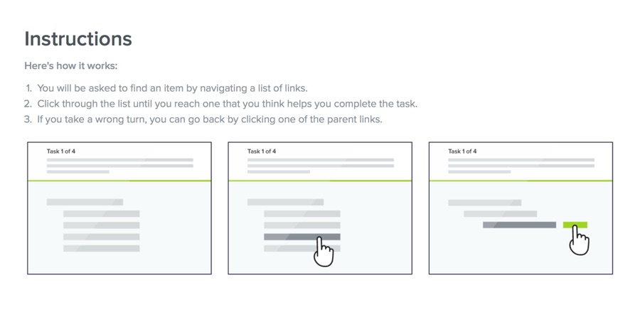
After conducting a content audit and tree testing, I proposed an alternative approach to structuring data to improve browsability on the site.
UI/UX Design
I redesigned the website putting mobile first. This involved creating wireframes, user flows and visual mockups based on strict brand guidelines.
Prototyping
I created prototypes to validate and better communicate my ideas. This helped in gaining support and provided a foundation to drive decision making.
Planning and Delivery
In collaboration with the digital product manager, I helped devise a delivery strategy, balancing customer and business goals.
Discovery Phase
As with any new undertaking, a significant amount of time was spent gathering and analysing data. I began with Google Analytics to get an overall picture of the site and its audience. This was followed by a self-conducted cognitive walkthrough and a short round of user testing to highlight existing usability issues. In addition, I analysed customer complaints to find recurring problems and validated my findings with the customer service team.
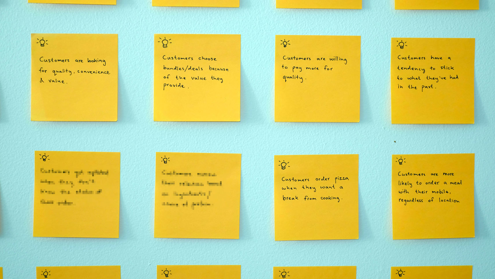
With a complete picture of the issues, I moved on to researching the customer. As I was working with limited resources, I decided to run a number of short polls on the website to learn the behaviours and motivations of the customer. Furthermore, I conducted a small but more in-depth survey with family and friends.
User Journey Mapping
From the very beginning, I found it quite difficult to get any changes, even the simplest bug fixes, across the line. This was largely due to competing business goals and limited development resources. As a result, I decided to put together a couple of user journey maps to better convey the current user experience. My hope was that the use of visualisation and storytelling would help the greater team empathise with the customer and understand the issues they faced.
Despite being in a position that could only influence the online experience, I made it a point to include every step of the user’s journey from when it begins (e.g. google search), right up to consuming the product.
Ideation Phase
As the user journey maps proved to be an effective communication tool, I piggybacked off of that success and proposed various design changes to the steps in the journey I could influence. The intent now was to look beyond usability and address the issues with desirability, findability and perceived level of value. In addition, I made a conscious decision to design for mobile first due to the large portion of mobile traffic the site receives. These efforts would (hopefully) result in an increase in conversion and average transaction value.
Unfortunately as this was not a blue-sky project, there were limitations to what could be changed. At times the only way of building consensus was by retaining certain aspects of the original.
First Impressions Matter
Problem
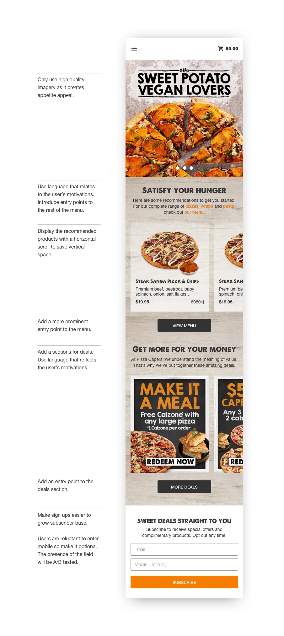
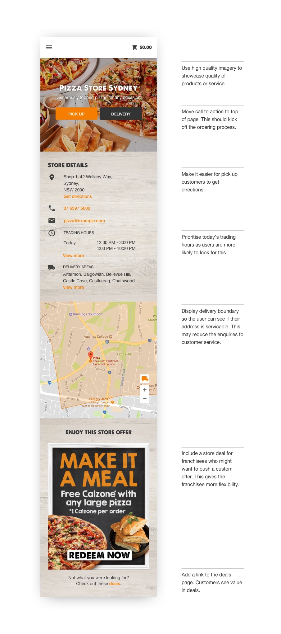
The home and store pages were in need of a redesign because they were the two most popular entry points into the site and they didn’t translate well to mobile. The original homepage was confusing as it failed to inform the user as to what it was they were looking at. It also didn’t address the user’s motivations or lead them to other parts of the site as most links were hidden behind the hamburger menu. The store page on the other hand, looked quite drab. It started off with an image of an empty store, which we all know is never a good sign when choosing a place to eat. Moreover, it lacked the appropriate call to actions that would lead the user to begin an order.
Solution
Both pages were redesigned to be more inviting. All changes (along with their justification) have been highlighted below.
Navigation & Browsing
Problem
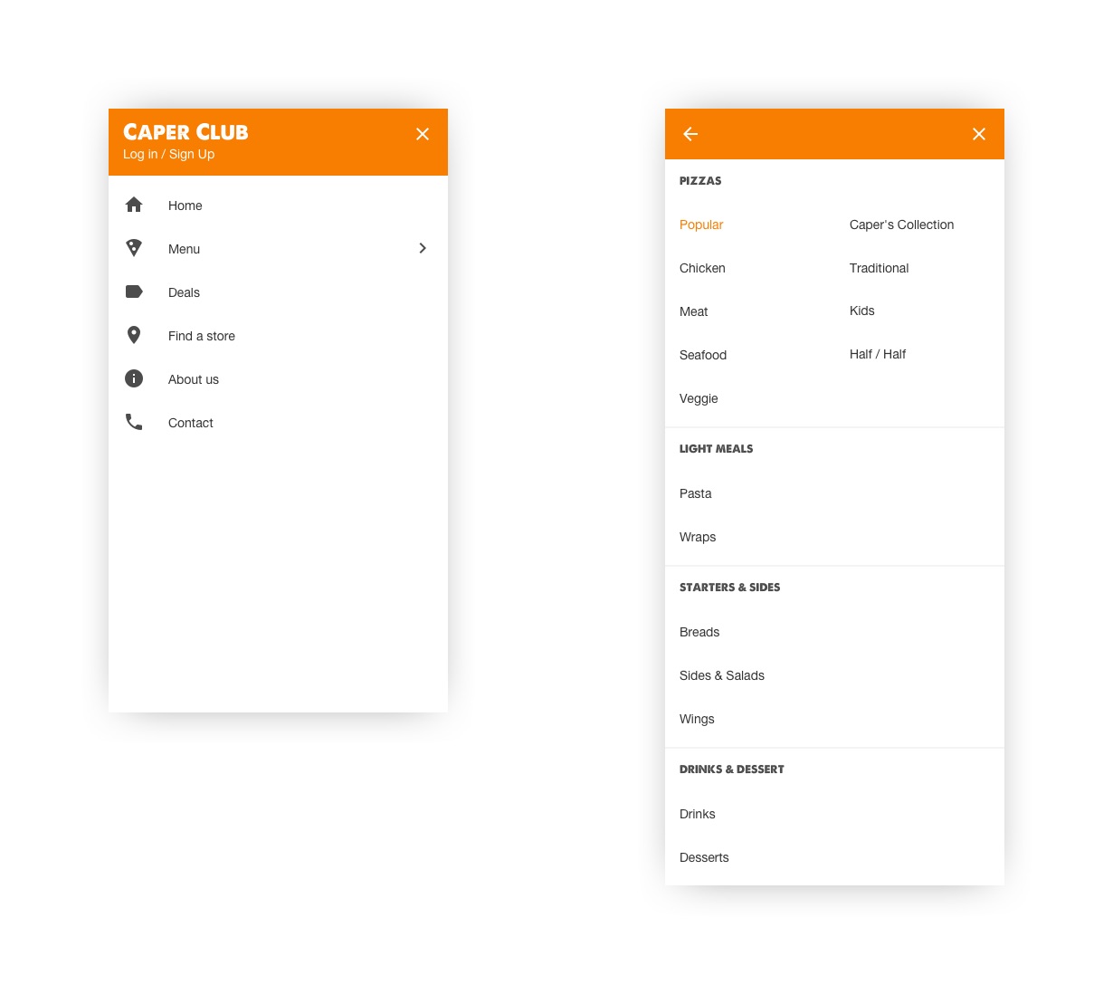
Another issue with the current site was that it wasn’t easy to browse or navigate. The navigation menu was cluttered and did not use intuitive category names (e.g. Caper’s Collection). To make matters worse, the category names weren’t displayed within the product catalogue on mobile. This meant users had to guess what category they were looking at.
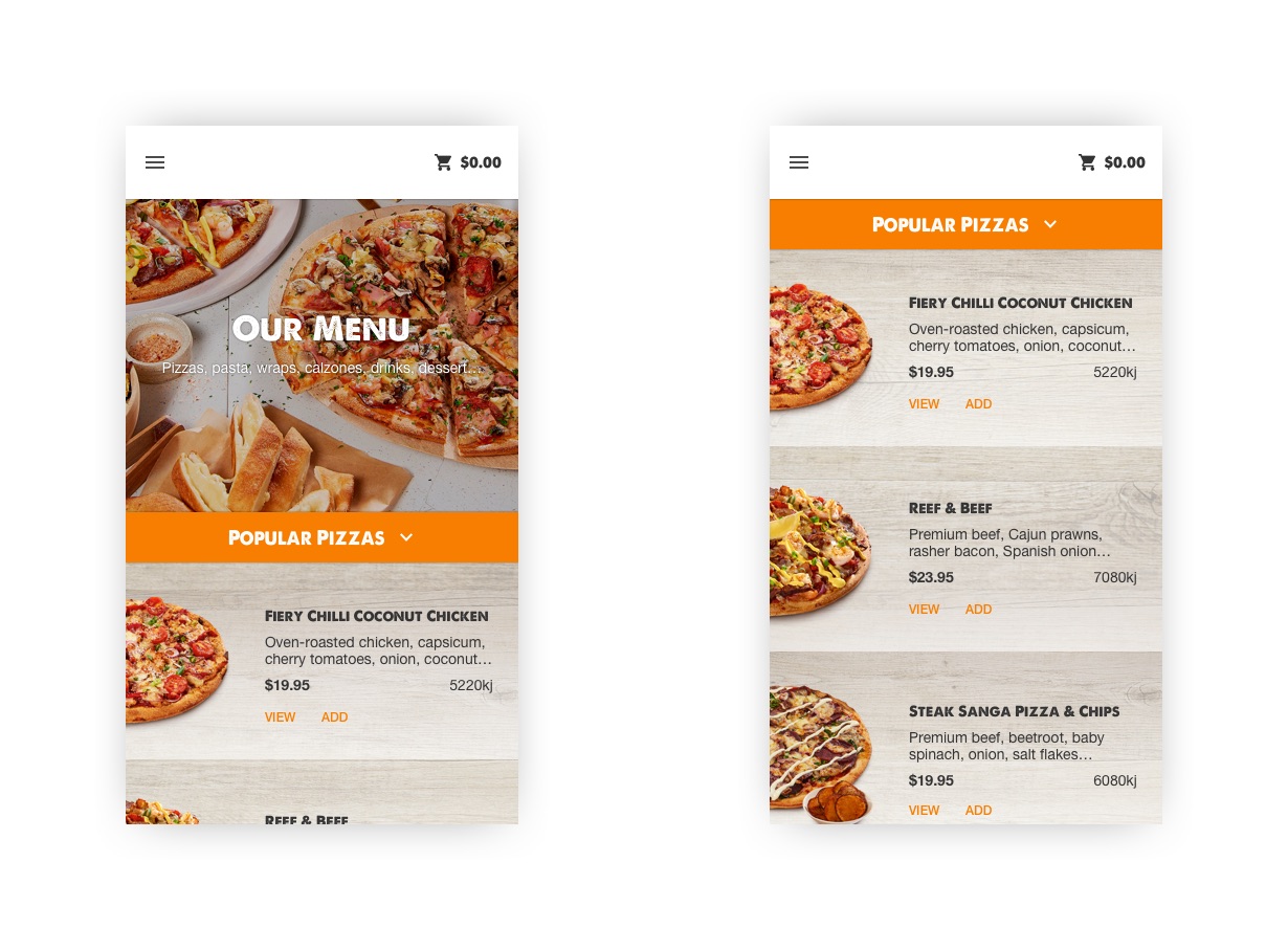
As for the categories themselves, they were overcrowded and lacked any form of logical ordering. In addition, products weren’t displayed efficiently. The product cards did not include a description forcing the user to click into the product to get an inkling of what ingredients it contained. Apart from that, users browsing on a mobile device could only see one product at a time as one product card took up 80% of the viewport.
Solution
To reduce the clutter in the navigation menu, a two level hierarchy was proposed. This made it possible to introduce more intuitive categories (i.e. meat, seafood, veggie) while maintaining the existing categories which were important to the business.
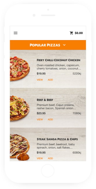
The product catalogue was redesigned with a sticky header. Not only did this tell the user what they were looking at, it doubled up as navigation control. As for the product cards, they were completely overhauled to display more information while taking up less visual real estate.
The Order Flow
Problem
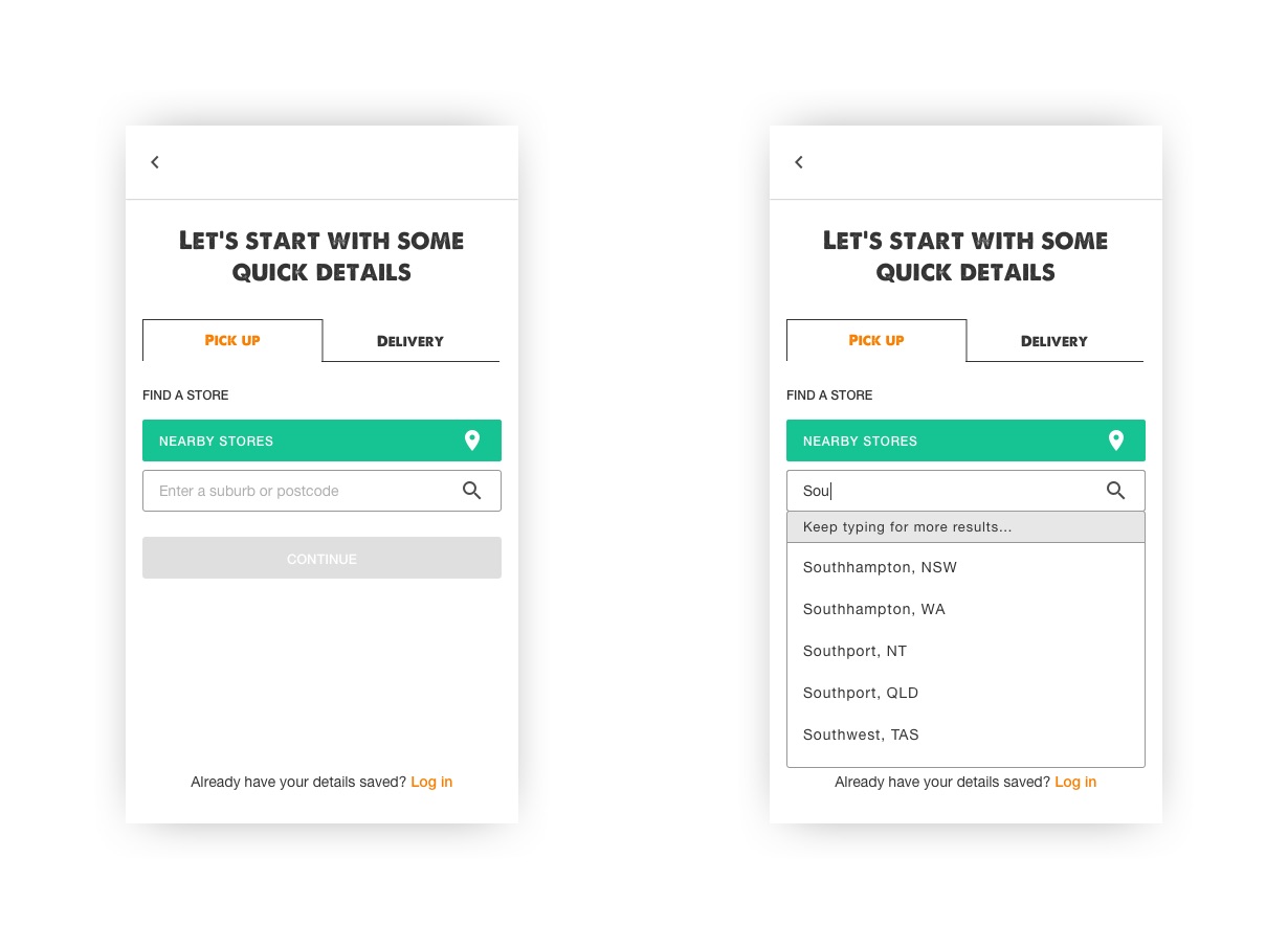
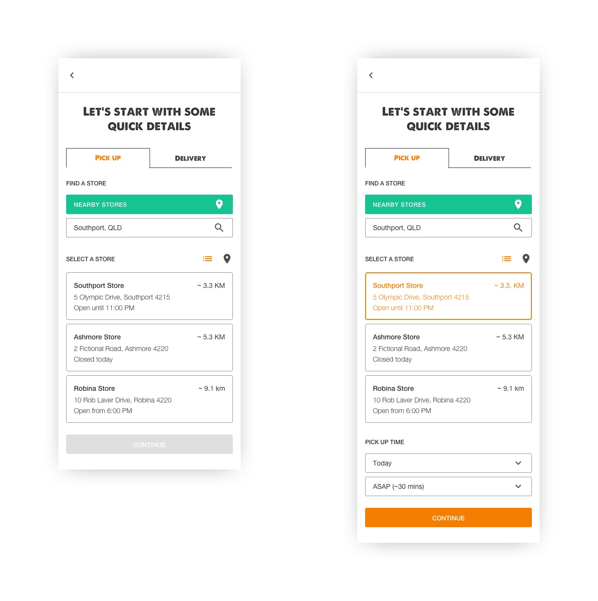
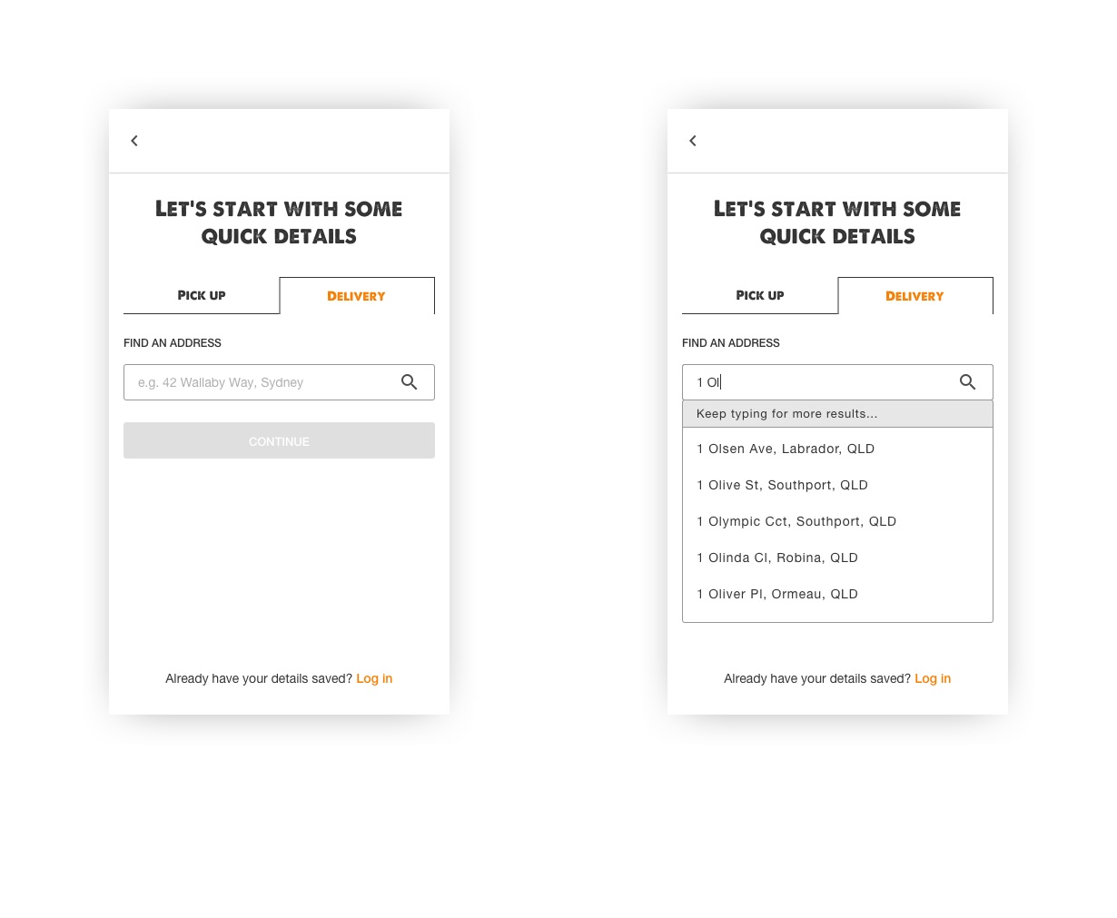
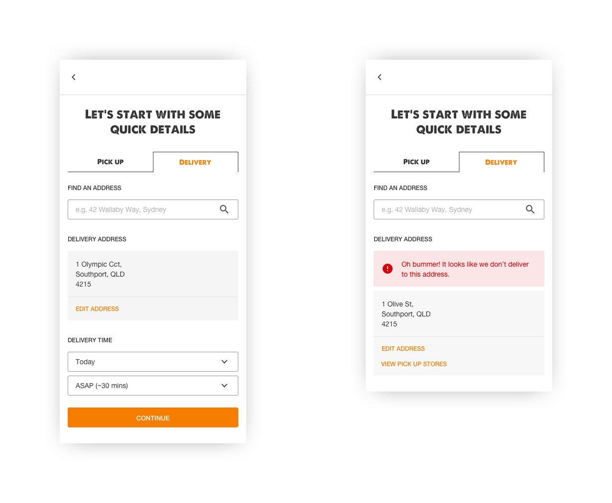
The whole order flow (i.e. steps taken to place an order) had to be reworked as the required fulfilment information (e.g. pick up location, delivery address, time) was collected too late in the process. For example, if a customer spent 10 minutes putting an order together, they could potentially discover that their local store was in fact closed upon reaching the checkout. From a business perspective, it was impossible to introduce variable pricing without a way of collecting fulfilment information at the very beginning.
Solution
Collection of the fulfilment information was moved to the start of the order process. As soon as the user added their first item to the cart, they would be prompted for the required information. Care was taken to ensure the user could still browse the entire menu before beginning their order and that only minimal information was collected upon initiation.
Assembling a Deal Bundle
Problem
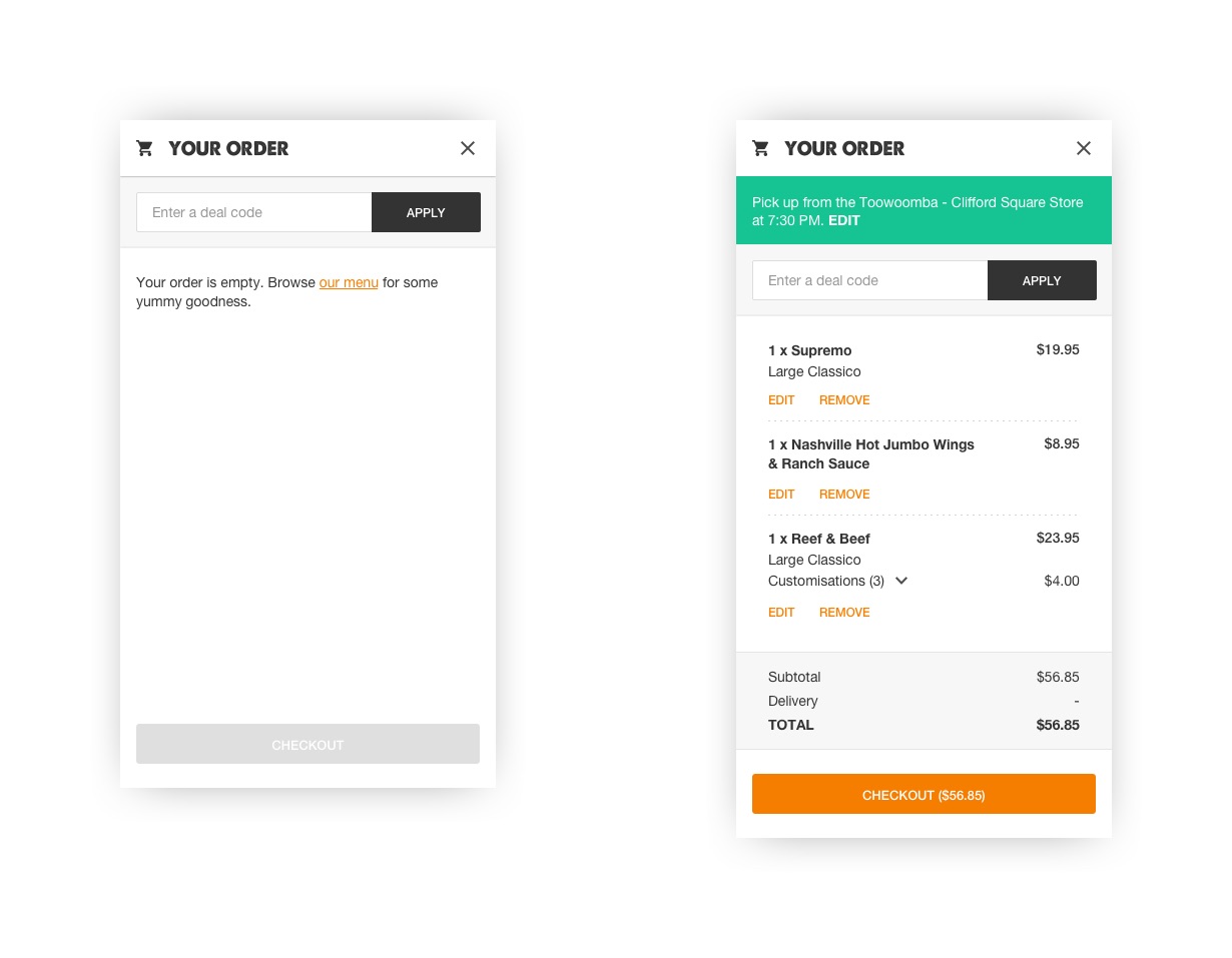
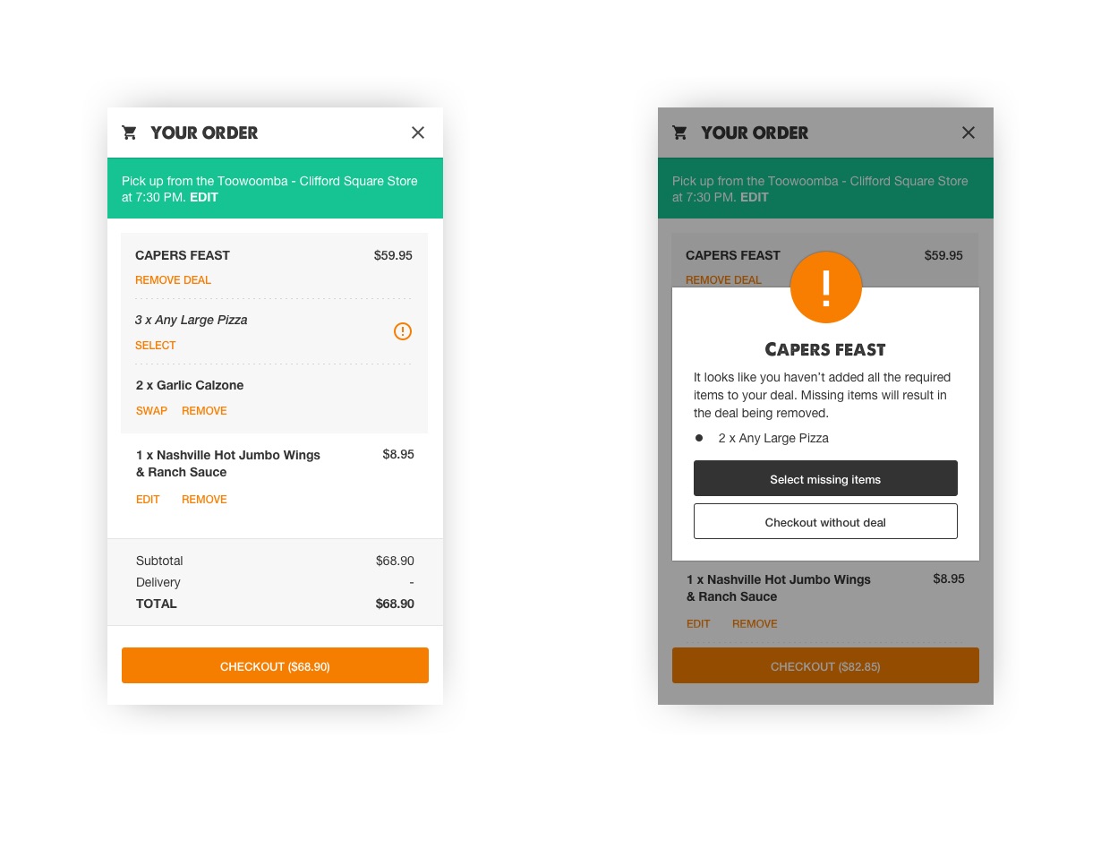
Assembling a deal bundle (i.e. combination of products purchased at a discounted rate) was not an easy task as the customer was expected to do all the heavy lifting. After being presented a paragraph of instructions, the customer had to locate the appropriate products and add them to the cart. Any missed items would result in the conditions of the bundle not being fulfilled thus resulting in the customer paying full price.
Solution
The cart was significantly redesigned to solve this issue. Instead of simply displaying a block of text to the customer, an interactive deal bundle would be added to the cart. This deal bundle would list all qualifying items and provide links to the appropriate product categories. In the case of items like bread or drinks, the deal bundle would be populated with a default item along with an option to swap. Finally, a validation step was added to warn users of an incomplete bundle before proceeding to checkout.
Checkout
Problem
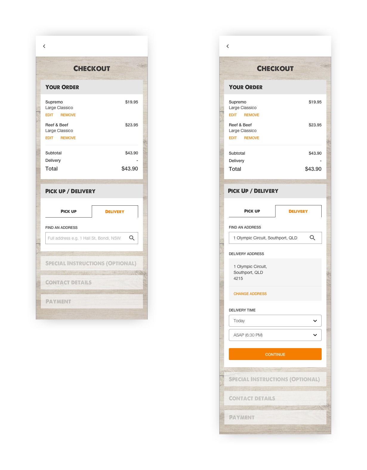
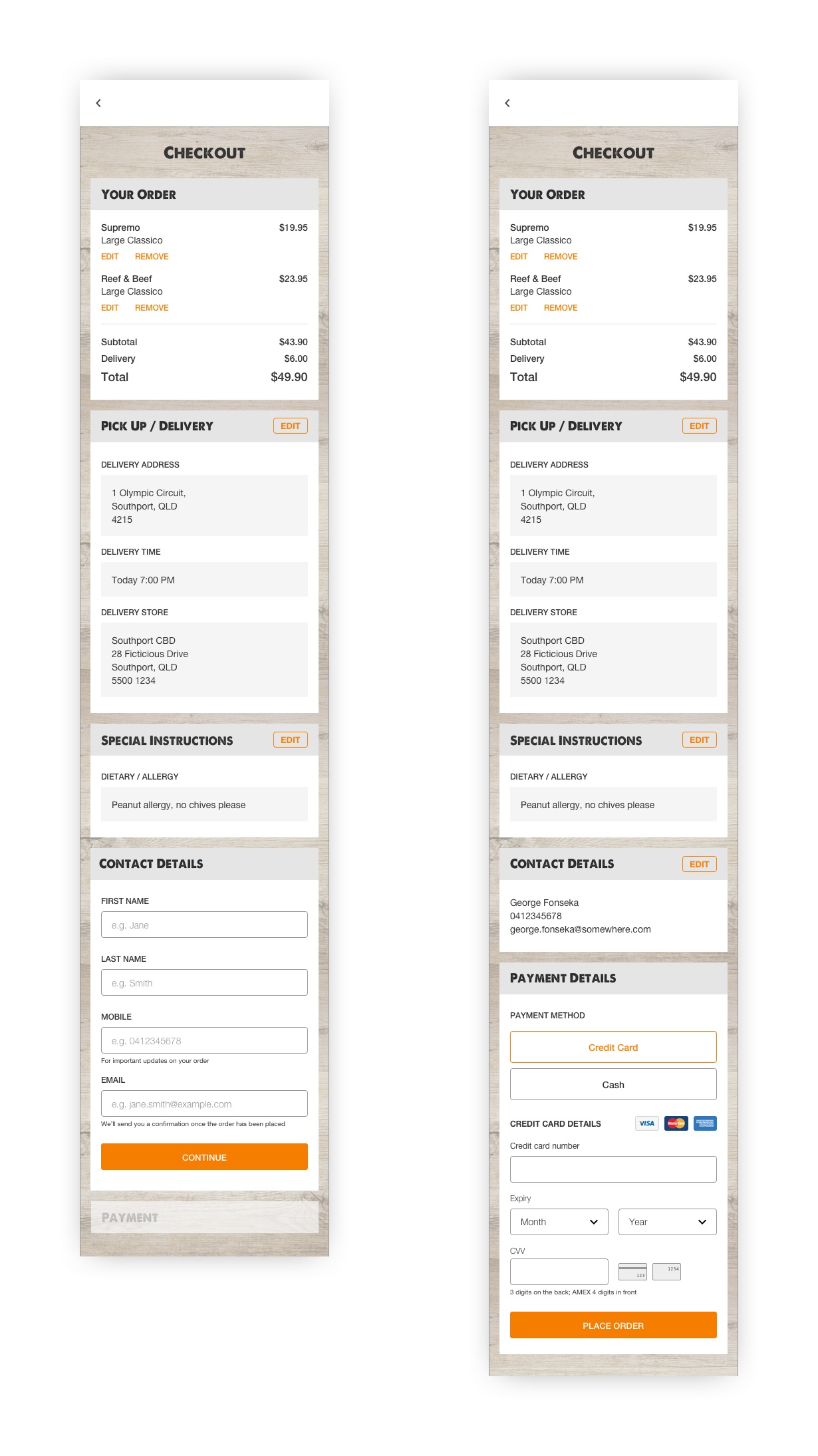
Despite having a decent conversion rate, the checkout presented a number of opportunities for improvement. It had too many links leading customers away resulting in abandonment; the two field address input was confusing and buggy; and the form was not user-friendly as it lacked good messaging and was only validated at the very end.
Solution
The checkout was redesigned to take the user through the process one step at a time. At each step, the user would fill out the required information, which would then be validated before proceeding on to the next step. Besides that, the number of links on the checkout page was significantly reduced to ensure the user remains focused on the task at hand.
Design Validation & Prototyping
As most of our development was done externally, it made sense to prototype and test the designs before committing to the actual build. Depending on what I was actually testing, I used different tools to get the job done. Most of the test participants were made up of family, friends and internal employees from different areas of the business (i.e. unrelated brands or roles). This was unavoidable due to a limited budget.
An extra benefit of prototyping was that it became an effective way of communicating ideas both to the business and the external development resources. Wireframes and visual mocks are great but it doesn’t convey as much as an interactive prototype. In the words of (someone at) IDEO, “if a picture is worth a thousand words, a prototype is worth a thousand meetings“.
Tree Testing
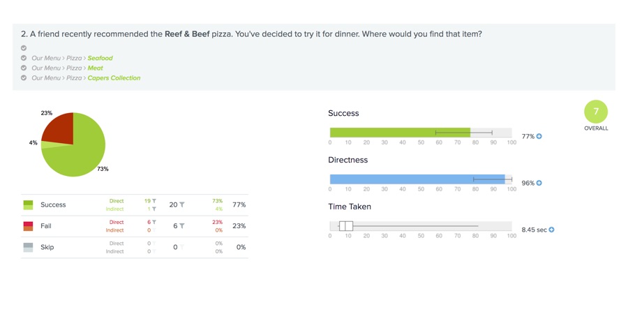
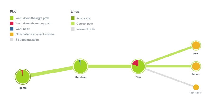
I employed tree testing in the early stages of exploring the new navigation structure. Using Treejack, I set up a navigation hierarchy which included protein based categorisation and tested it against approximately 20 participants. The positive test results provided the confidence needed to adopt the proposed changes.
Click Prototypes
Various designs were user tested using prototypes built with Sketch and InVision. A minimum of seven participants were recruited for each round of testing. Participants were given two or three prototypes and were asked to perform a set of tasks from a test script I had prepared. The successes and failures were recorded to measure the effectiveness of each design.
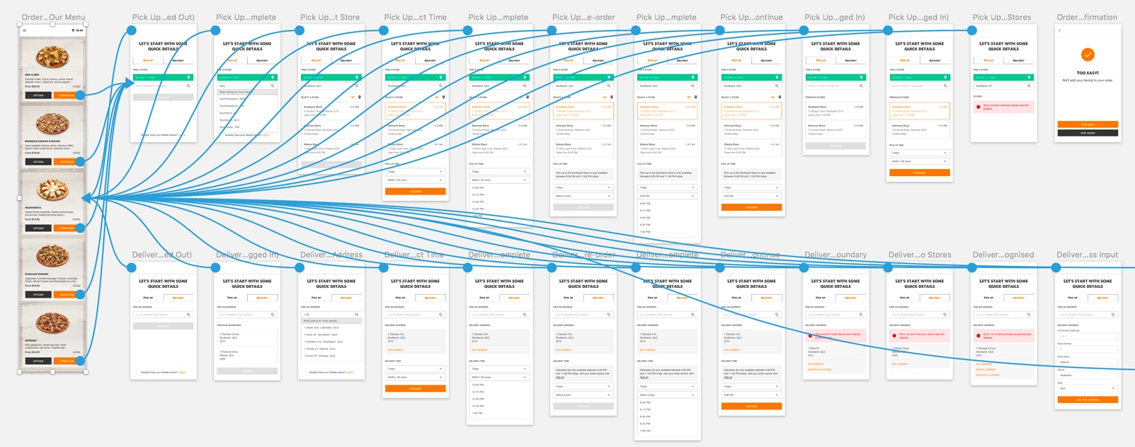
Order flow prototype created with Craft, a Sketch plugin by InVision.
For the most part, the InVision prototypes got the job done. They did however, fall short when the design relied on the use of animation as an interaction signifier. For those situations, I decided to use a prototype built with Principle.
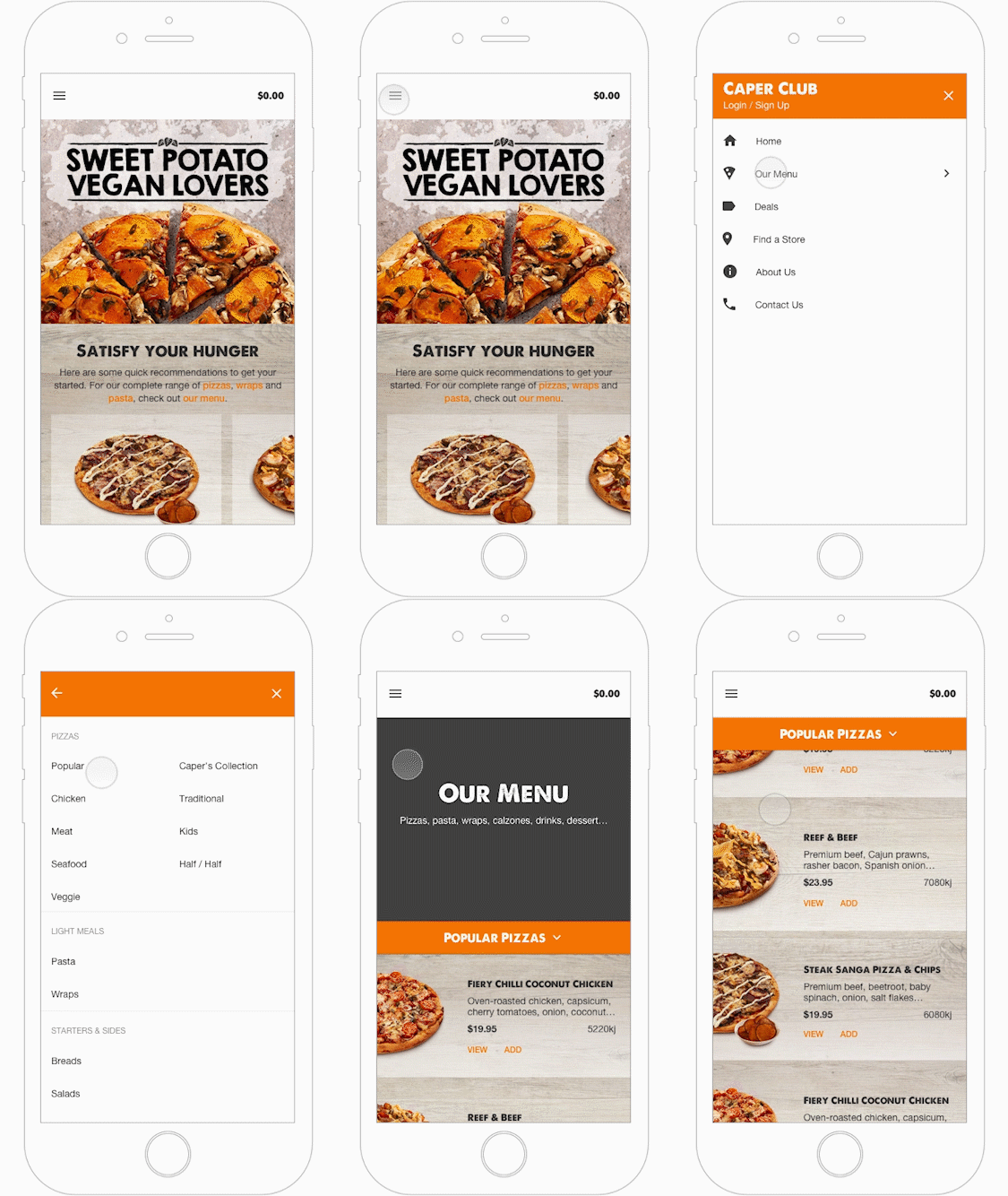
Prototypes created with Principle.
Note: Best viewed on desktop as the frame rate has been reduced on mobile.
Implementation & Delivery
To balance the allocation of the limited development resources between the UX improvements and the “business as usual” stream, the project was broken up into multiple stages. Stage one involved a substantial effort in bug fixing and addressing small usability issues (e.g. absence of feedback, layout issues on smaller devices, etc). Stage two saw the implementation of quick wins or stopgaps which leveraged some of the proposed ideas. The combination of these improvements resulted in an 8% increase in online conversion and a modest reduction in customer complaints related to online ordering. The success of these efforts will see the remaining enhancements delivered this year, which is something I look forward to.
