The Findability of Music
Information architecture (IA) is one of the most underrated and overlooked facets of user experience design. Perhaps this is because a well designed IA works so seamlessly it gives the false impression of minimal design effort. On the contrary, if a product is to feel natural and intuitive, then its IA needs to be designed with the utmost care and consideration.
The Role
I started working at Guvera, an ad-funded music streaming service, as a Software Development Team Lead while completing a Masters in Interaction Design. In 2015, I successfully transitioned into a UX role after months of highlighting usability issues and proposing ways of fixing them. My focus moving forward was to help the product design team improve the usability of the app and to establish UX best practices.
Customer Research
I conducted surveys and analysed customer feedback to better understand the customers’ motivations and behaviours.
User Testing
I organised and conducted in-person and remote user testing to bring to light usability issues and validate new designs.
Information Architecture
Using card sorting and tree testing, I produced findings to drive the restructure of Guvera’s information architecture.
Wireframing
I created wireframes and user flows to specify page layouts and interactions. I would then collaborate with our UI designers to create high fidelity mocks.
Prototyping
I created prototypes to validate and better communicate my ideas. This helped to gain buy-in and provided a foundation to drive decision making.
Oversight and Delivery
I collaborated with platform developers, testers and an iteration manager to ensure the quality and correctness of the final delivery.
Discovery Phase
In late 2014, the marketing team conducted a survey to gauge customer satisfaction with our service. Among the questions they asked, one in particular got my attention. It was, “If there was one thing you could change about Guvera, what would that be and why?”. Although open-ended questions are difficult to analyse due to their unstructured nature, I have a preference for them as they give participants the opportunity to express their thoughts in their own words. It can therefore, yield unbiased, more in-depth feedback.
Survey Response Analysis
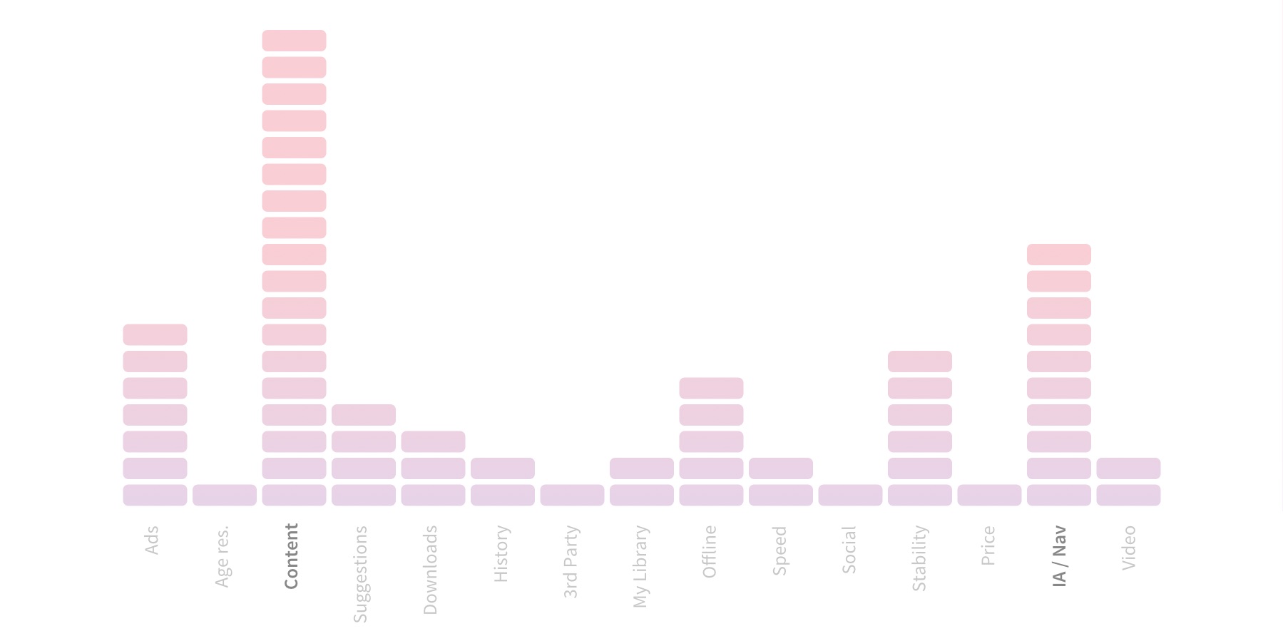
I painstakingly extracted approximately 430 complaints / suggestions from over 500 responses to that one question. These were then grouped into 15 areas of concern and tallied to produce the following bar chart.
Content issues which were primarily related to missing artist, tracks or albums, were most frequently observed. It is important to note that some of the responses could have been referring to content that existed in the system, however as the participants didn’t always provide the full details, the issue was categorised under “content”. Coming in second was IA/Nav issues, where participants clearly expressed the inability to find content or features that existed. Based on these findings (and the knowledge that the lawyers were working on the rights to more music), I decided to focus my efforts on findability.
Cognitive Walkthrough & User Testing
As the responses didn’t always pinpoint the exact nature of the problems, I conducted a cognitive walkthrough to further explore the issues behind findability. I would run through common tasks and take note of any issues that stood out (e.g. absent signifiers, missing feedback, mental model mismatch, etc). In addition to this, I ran a number of remote user test on usertesting.com to help uncover issues I might have missed as a result of being too close to the system.
User Interviews
Apart from uncovering usability issues with our the app, I made it a point to interview music listeners to understand their behaviours and motivations. I did this as understanding the audience is a vital step in designing a more natural experience. Although I had no budget to recruit participants, working on a music app made it easy as most people in my network listen to music on a regular basis. The following are some of the insights I gathered.
People use music to influence or enhance the way they feel.
People listen to music based on the activity they are currently engaged in.
People select music based on the genres they like.
People stick to music they already know.
Some people like to choose what they listen to while others prefer recommendations.
People have more trouble naming albums over artists and songs.
Ideation Phase
Based on all the findings gathered during discovery, we decided to work on two aspects of the app to improve findability. The first was the Organisation System as the existing structure was quite basic and didn’t provide users with many options for browsing the catalogue of over a million songs. The second was the Search System which was typically used by users who knew what they were looking for but weren’t always able to find it due to usability issues.
Organisation System
The content on Guvera was primarily made up of artists, albums, tracks and playlists. As with many other streaming services at the time, browsing was done based on content type, rather than a more natural classification such as type of music. Imagine trying to hire someone without the ability to search for candidates based on occupation.
As we found out during the discovery phase, people choose music based on certain themes such as genres, moods and activities. By introducing these categories to the taxonomy, we would give users a better way of browsing.
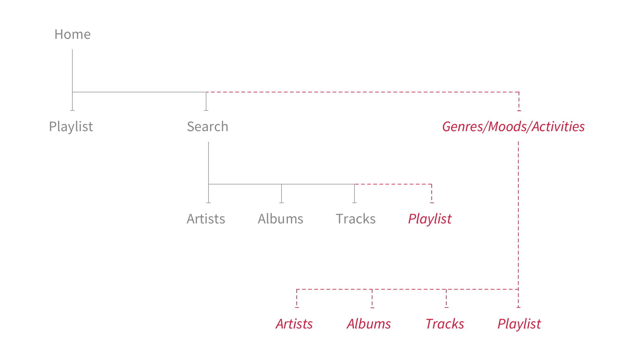
When the idea of themes based on genres, moods and activities was first brought up, it didn’t get the warm reception I had hoped for. Genres weren’t completely opposed, but moods and activities required a bit more convincing. So I decided to run a card sort to explore the ways people categorise music.
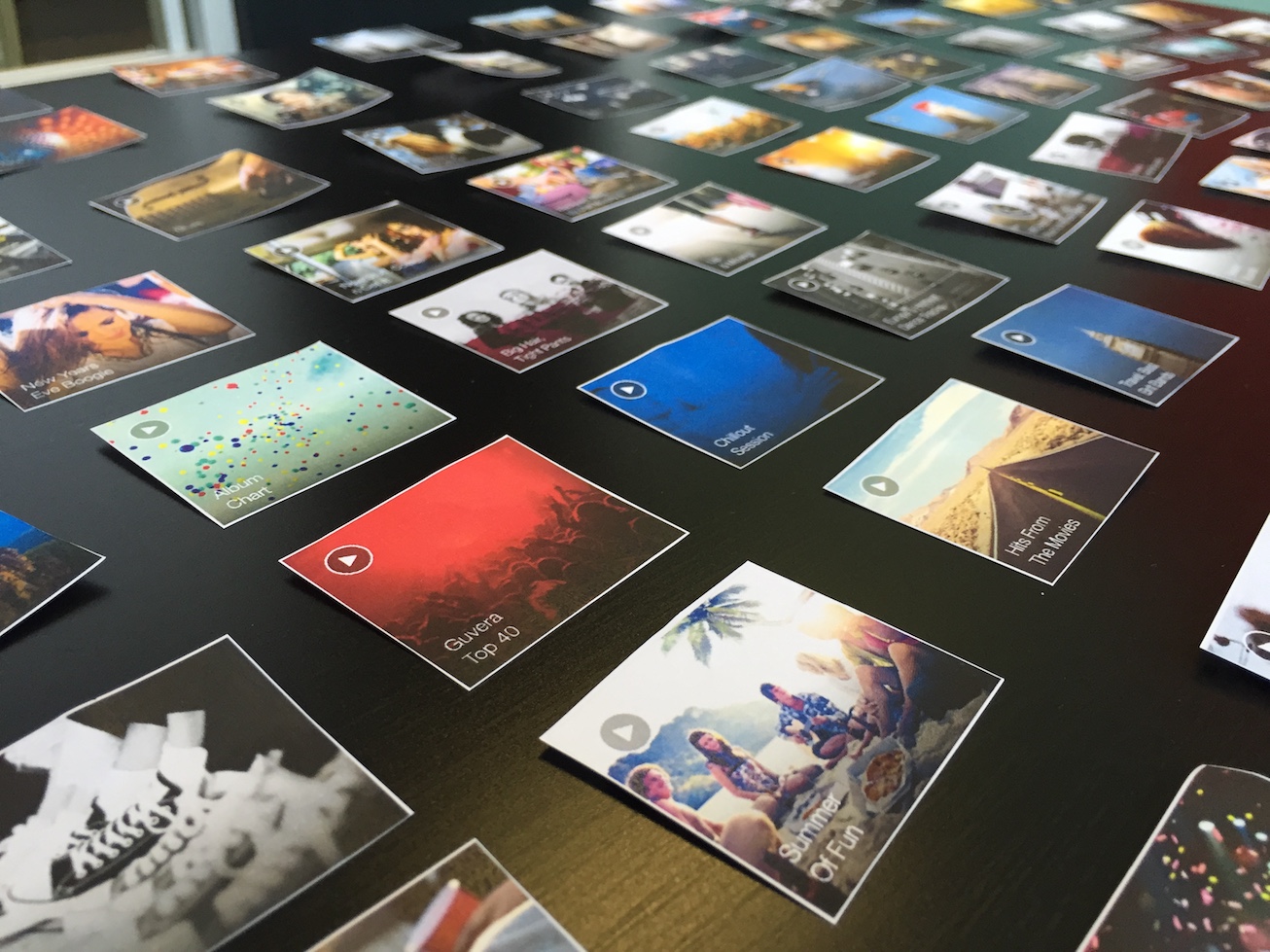
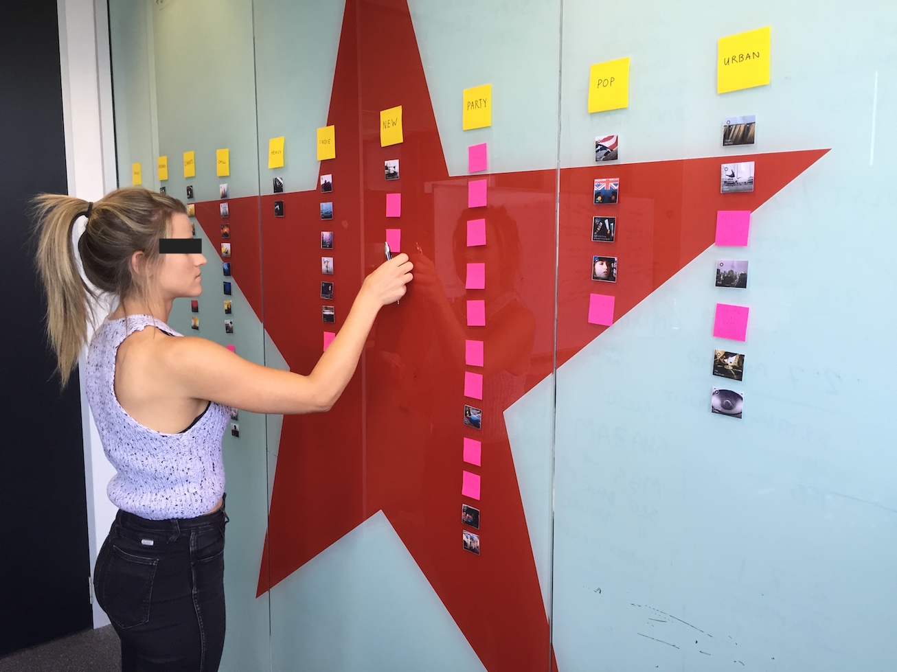
To prepare for the card sort, I compiled a list of 80 playlist that were representative of the content we had on our platform. I then cut out cards using the playlist tiles we had within the app and recruited 12 people from within the business. The participants came from various backgrounds and made up a 50-50 split of male to female. Sessions ran between 20-40 minutes and took three days to complete.
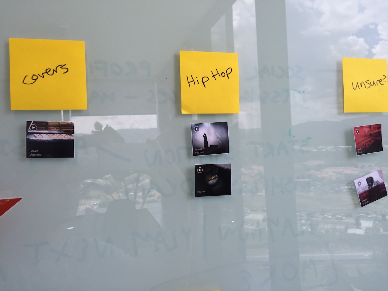
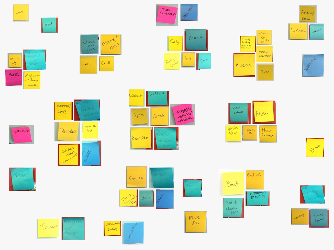
Upon completion, the suggested categories from all participants were compiled and grouped to see what patterns emerged. Apart from the typical music genres which were quite consistent among all participants, categories appeared around activities such as working out, studying and party. Categories based on moods like “chilled” and “feel good” appeared but weren’t as prevalent. In addition to that, a couple of themes such as time periods, festivities and charts appeared.
Consequently, we decided to introduce the concept of “channels” which could be any sort of theme such as genres, activities or moods. The channels were used to logically group various types of content such as playlists, artists, tracks and albums. So if someone liked hip hop music, they could browse the hip hop channel to find playlist or trending artists to satisfy their taste. An added bonus we discovered later was that channels were a great way of serving up targeted ads. This is because the ads in a particular channel would be related to that particular theme (e.g. working out channel has ads from a gym, studying channel has university ads, etc).
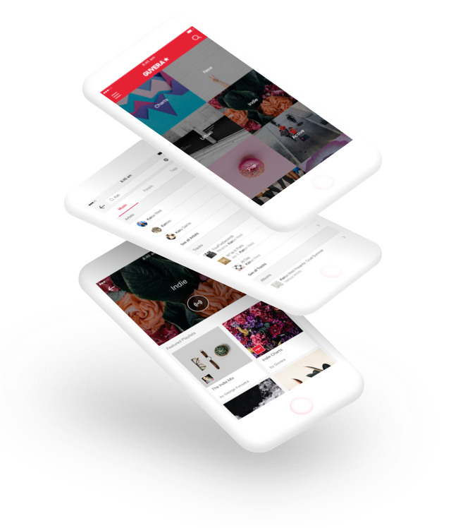
The following are two high-fidelity mocks of the channels on the home page and the indie channel page done by our UI designers.


Search System
Our search feature was pretty limited in the sense that it only allowed users to search for artist, albums and tracks. There were a couple of blatant issues that were found such as the search not showing useful meta data with the results. For example, while searching for tracks the artist names weren’t displayed due to an issue with the API settings. This made it quite challenging when searching for content with a common name. Apart from that, the search was also plagued with more complex issues such as irrelevant results due to the search algorithm or the way albums and tracks were ingested. Below are some examples of the issues accompanied by the proposed solutions.
Initial Search Screen
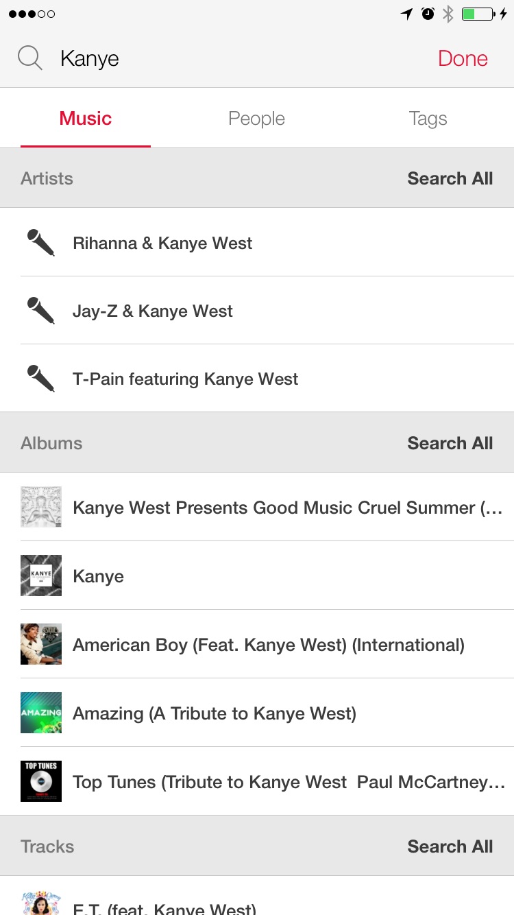
Problems
- The “Search All” text buttons that appear on the right side of the section header were easily missed as a user tends to scan the results downwards.
- The sections are not ordered based on a user’s searching behaviour i.e. album is the least popular method.
- Artists do not exist in the system if we do not have the rights to their music. This is never explained to a user.
- Artist collaborations result in a new artist being created within the system (e.g. Rihanna & Kanye West).
- Albums and tracks are missing the artist name making it difficult for a user to find what they are looking for.
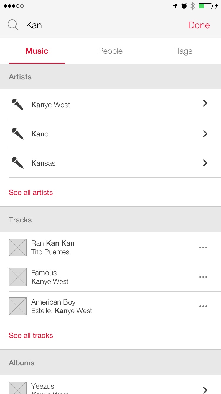
Solutions
- “Search all” buttons moved after third result and highlighted to ensure it is not missed.
- Sections ordered based on search method popularity i.e. artist followed by tracks then albums.
- An artist should exist in the system regardless of whether or not we have the rights to their music. This would allow a user to navigate to the artist page where the issue with music rights can be explained.
- Artist collaborations should link the track to all collaborating artist, improving data integrity.
- The artist name should be presented with the album or track.
Secondary Search Screen (Tracks)
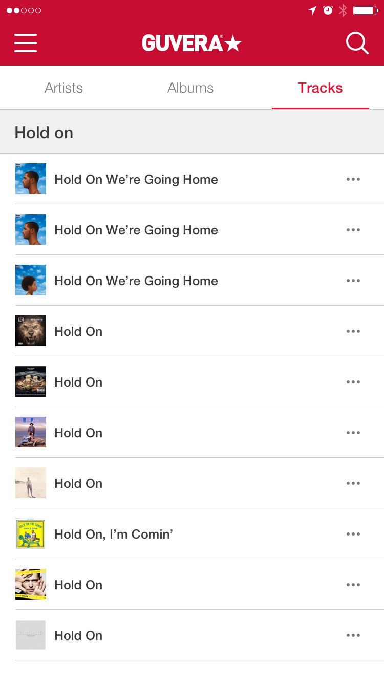
Problems
- Duplicate results displayed due to an ingestion issue. The same album was ingested twice.
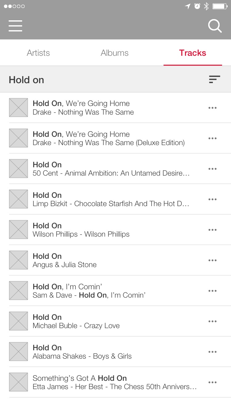
- Track name not accompanied by artist name. In this example a user searching for Wilson Phillips’ “Hold On” would have trouble finding it.
- When dealing with large result sets, there is no option to sort the result.
Solutions
- Fix ingestion process to ensure duplicate content is created. There should only be duplicate results if there are different versions of the album.
- Include artist and album name on a second line.
- Introduce option to sort the results (e.g. relevance, track name, artist name) on the top right of the screen.
- Highlight the matched string so it is easier to identify.
Secondary Search Screen (Albums)
Problems
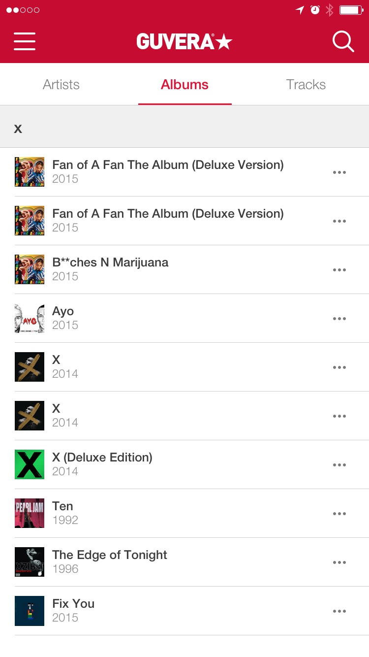
- Irrelevant results due to search algorithm.
- Album not accompanied by artist name. In this example a user looking for Ed Sheeran’s album ‘X’ would have trouble locating it.
- When dealing with large result sets, there is no way of sorting the results.
- The default action when selecting an album was to play it. This was a jarring experience when the incorrect album was selected.
Solutions
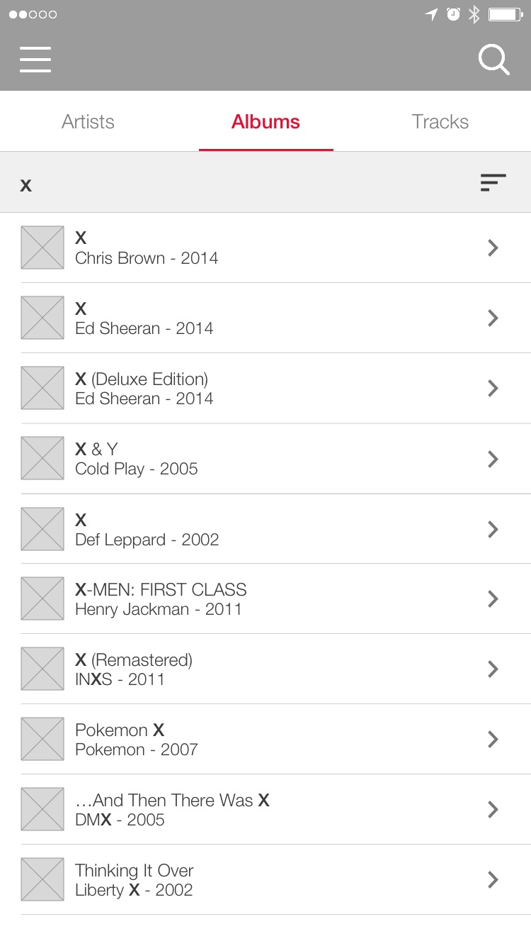
- Tweak the search algorithm to take into consideration the position of the matched string.
- Include artist name on the second line.
- Introduce option to sort the results (e.g. relevance, album name, artist name) on the top right of the screen.
- Change the default action to navigate to the album.
- Highlight the matched string so it is easier to identify.
Design Validation
As most of the proposed designs were deemed to be a vast improvement to what we had prior, we were comfortable releasing the product without testing every aspect. Simple things that could be tested like category names and button placements, were tested throughout the design process. However, certain aspects that required complex integrations and content set up, such as the search algorithm and the channels, were tested post-release.
Tree Testing
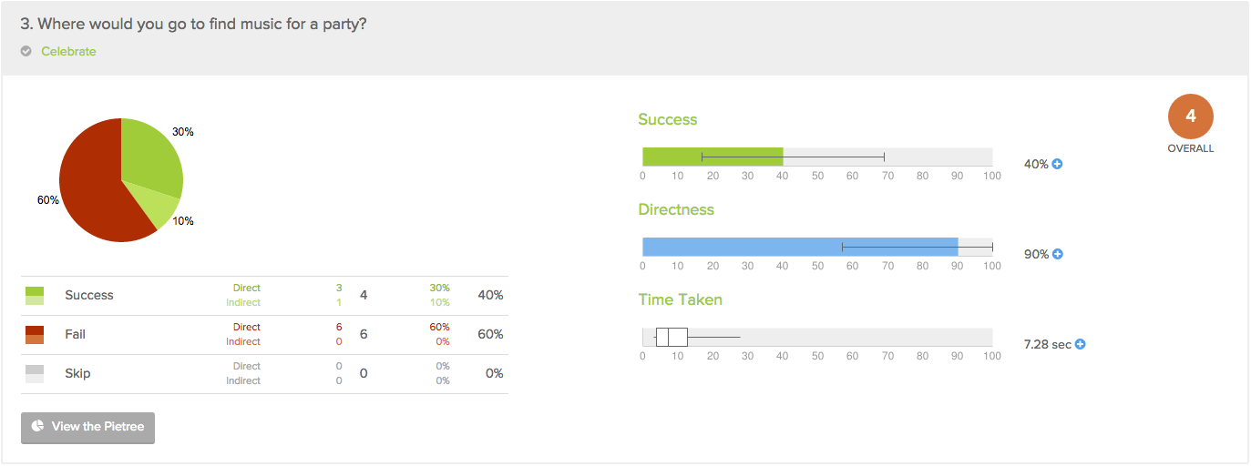
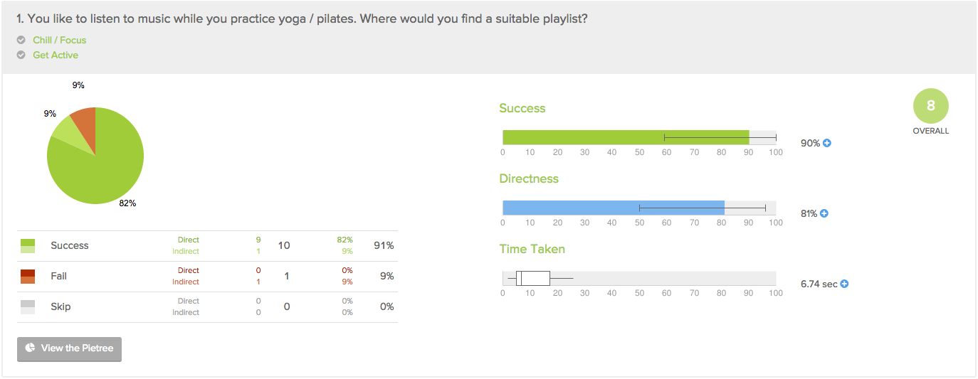
As the content curators decided to tweak the music categories or channel names that were decided on after the card sort, I decided to run a tree test to ensure they would still work. The test consisted of approximately ten questions asking participants to find music for various occasions.
User Testing
To evaluate the effectiveness of the new search and browse features, I recruited ten participants via usertesting.com and gave them a set of tasks to run through. The tests showed that the new search was easier to use and resulted in less errors. With regards to channels, the test showed that some users didn’t initially get the concept of it but understood it better after a bit of browsing. The test also highlighted an issue with the concept of stations within channels, which is beyond the scope of this case study.
Conclusion
Overall the design changes proved to be a success. The average time it took first-time users to play their first track was halved, the retention rate for new users was up and there was even an increase in ad conversion. The real win however, was the cultural shift within the organisation to incorporate user experience design into the way we built our products.
