RFG · 2016
Enhancing the Ordering Experience
TL;DR
The online ordering experience for two national pizza brands was falling short against the rising bar set by food aggregators like UberEATS and Deliveroo. As the sole UX Designer at RFG, I used research, journey mapping, and iterative prototyping to redesign the end-to-end experience — from first impressions through to checkout. Early delivery stages resulted in an 8% increase in online conversion and a reduction in customer complaints.
User journey mapping · Usability testing · Tree testing · Information architecture · Wireframing · Prototyping · Mobile-first design · Stakeholder management
Certain information has been omitted and obfuscated in this case study. The opinions presented here represent my views alone, not of my current or past employers.
When every restaurant is available online through aggregators like UberEATS and Deliveroo, there's no room for a subpar experience. In late 2016, I joined RFG as the sole UX Designer, leading the effort to improve the online ordering experience for two national pizza brands.
Discovery
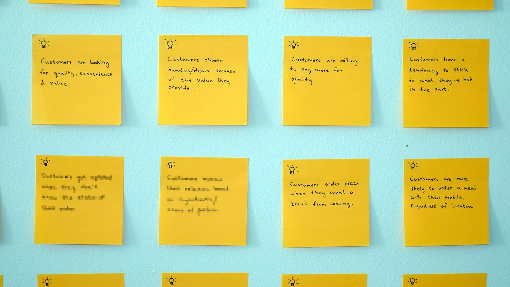
I started with Google Analytics, a cognitive walkthrough, and a short round of usability testing to surface existing issues, then cross-referenced findings against customer complaints and validated them with the customer service team. To understand motivations and behaviours, I ran polls on the site and a more in-depth survey with a smaller group.
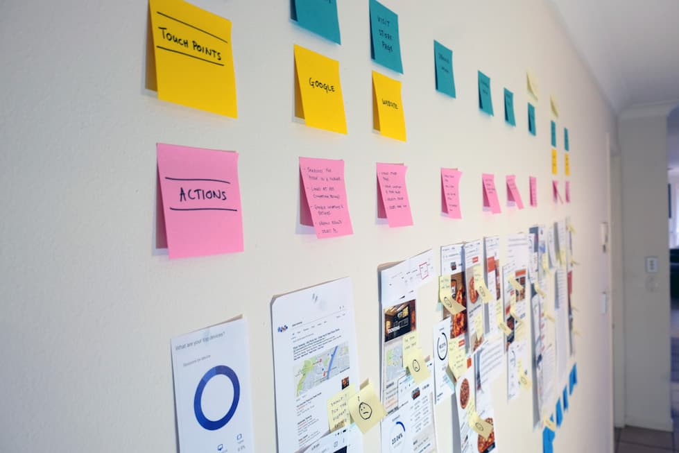
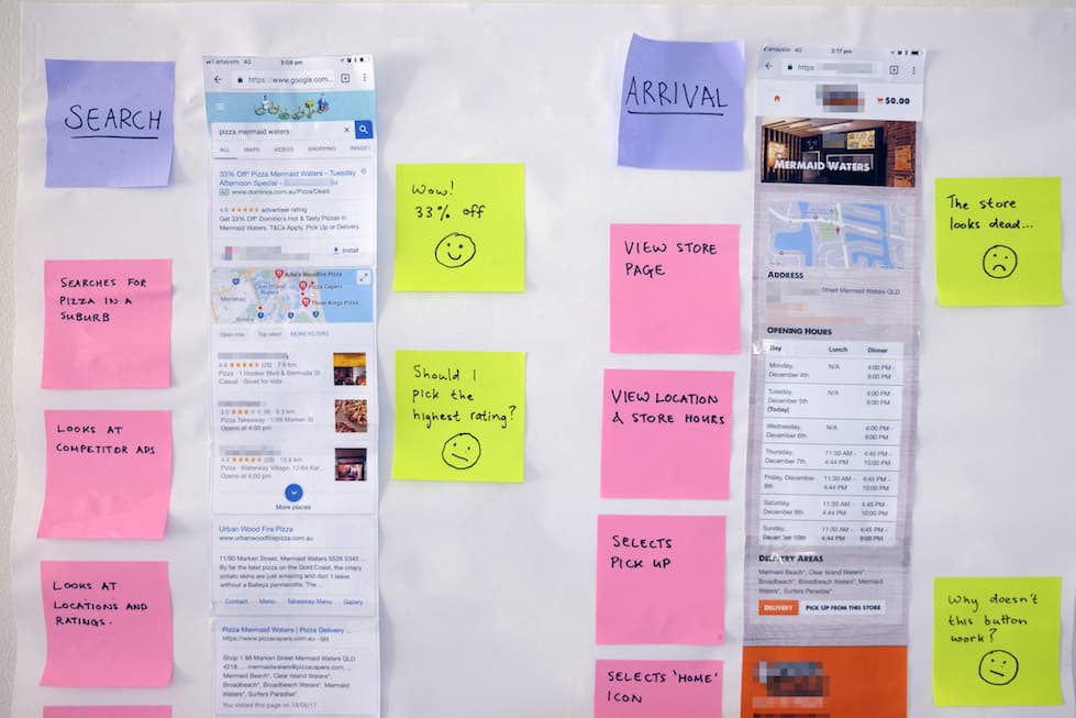
Getting changes across the line proved difficult from the start — competing priorities and limited development resources meant I needed buy-in before anything could move. I created user journey maps covering every step from Google search to consuming the product, giving the broader team a visual, story-driven way to empathise with customers and understand the friction they faced.
Ideation
With stakeholder buy-in established, I proposed design changes across the experience — mobile-first throughout, given the volume of mobile traffic. The focus extended beyond usability to desirability, findability, and perceived value.
As this was not a blue-sky project, there were limitations to what could be changed. At times the only way of building consensus was by retaining certain aspects of the original.
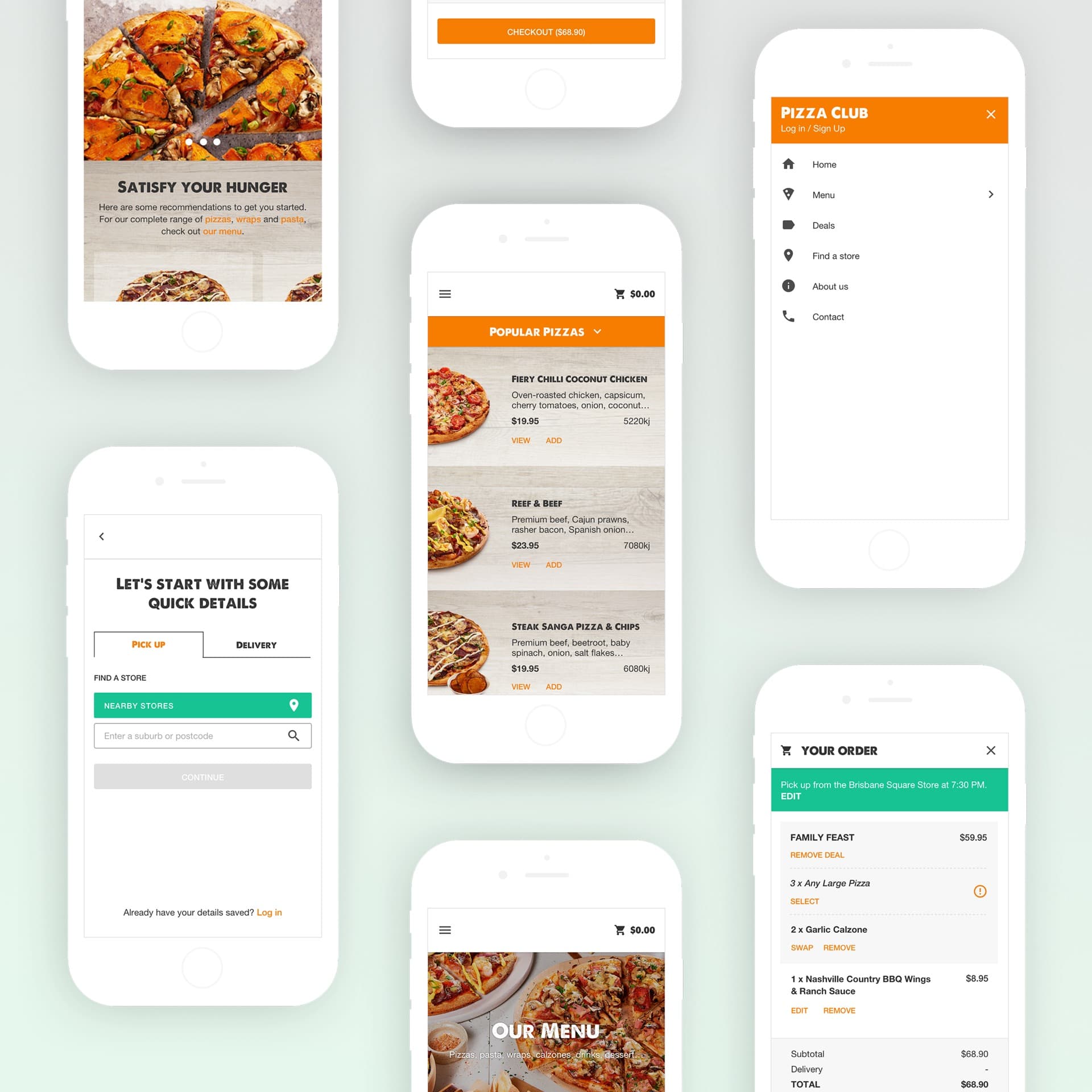
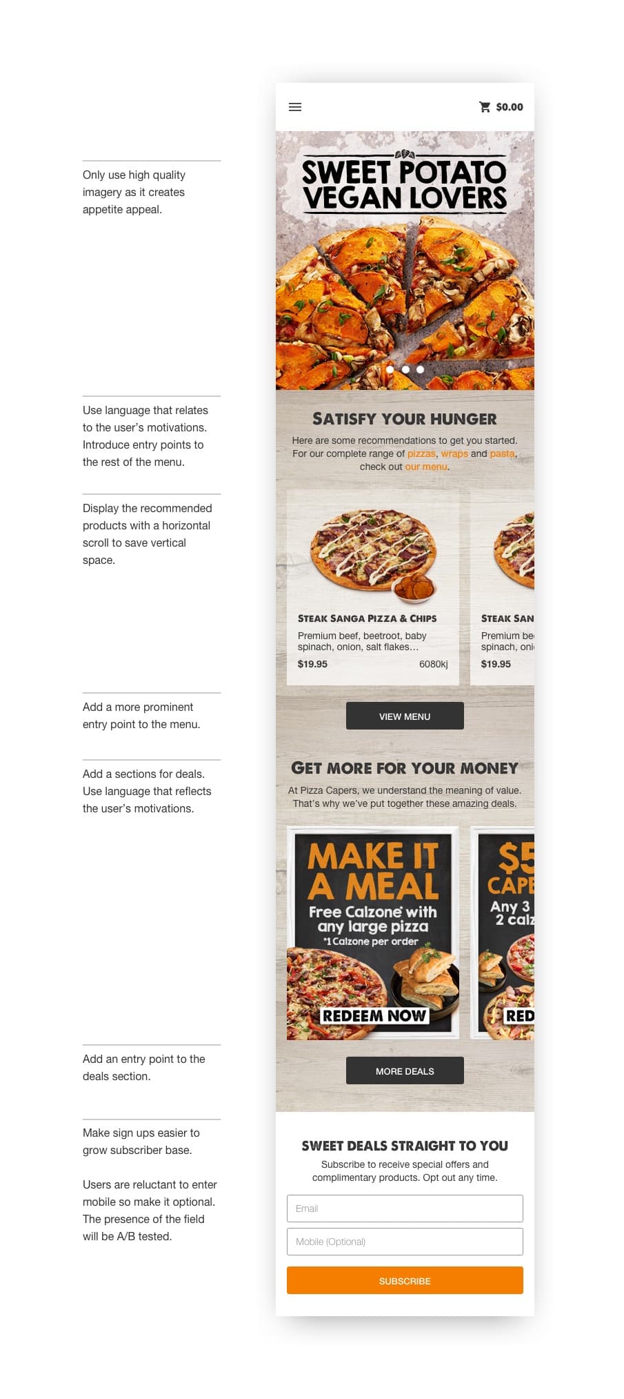
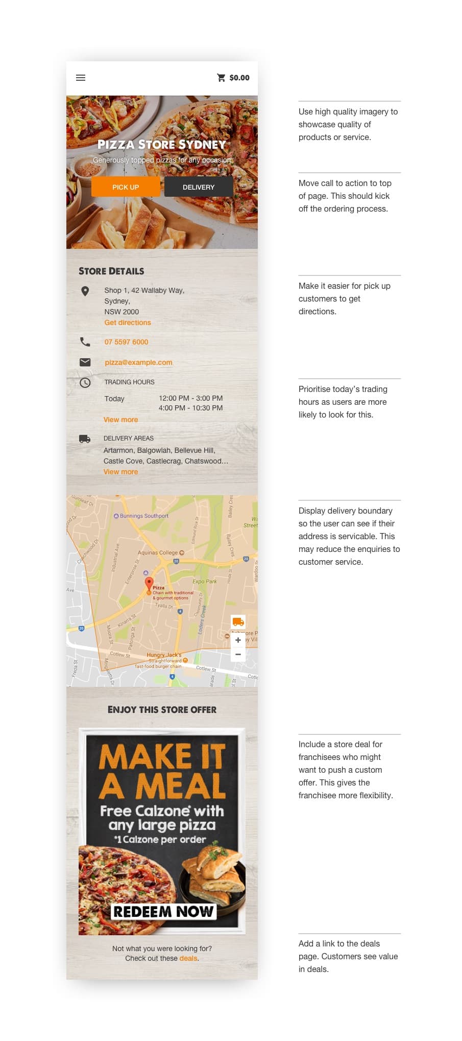
First Impressions
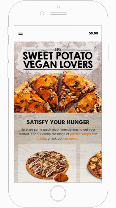
The homepage didn't communicate what users were looking at and buried most navigation behind a hamburger menu. The store page opened with a photo of an empty restaurant and had no clear call to action to start an order. Both were redesigned to be more inviting, with clearer value communication and prominent calls to action.
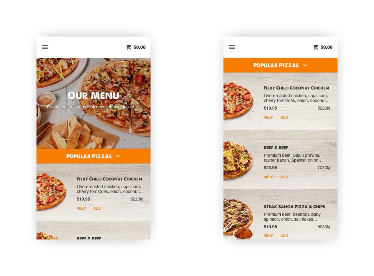
Navigation & Browsing
The navigation used unintuitive category names, and on mobile those names weren't even visible within the catalogue — users had to guess what they were browsing. Product cards had no descriptions and a single card took up 80% of the viewport.
A two-level hierarchy introduced more intuitive categories (meat, seafood, veggie) alongside the existing ones. The catalogue got a sticky header that doubled as navigation, and product cards were overhauled to show more in less space.

Order Flow
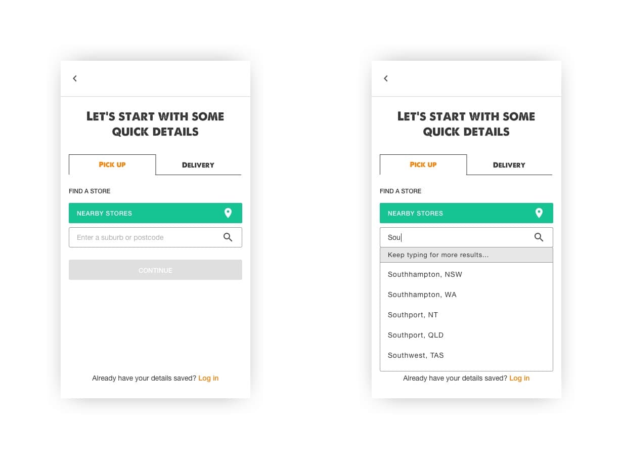
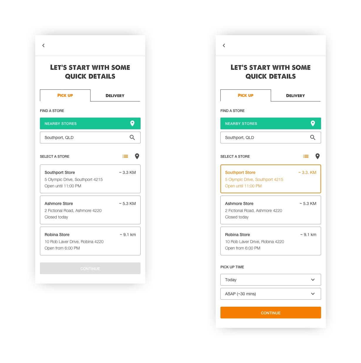
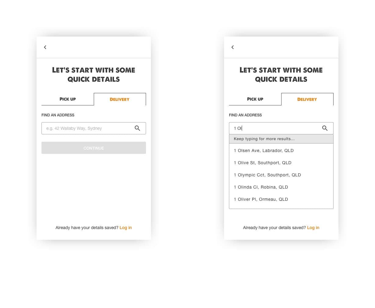
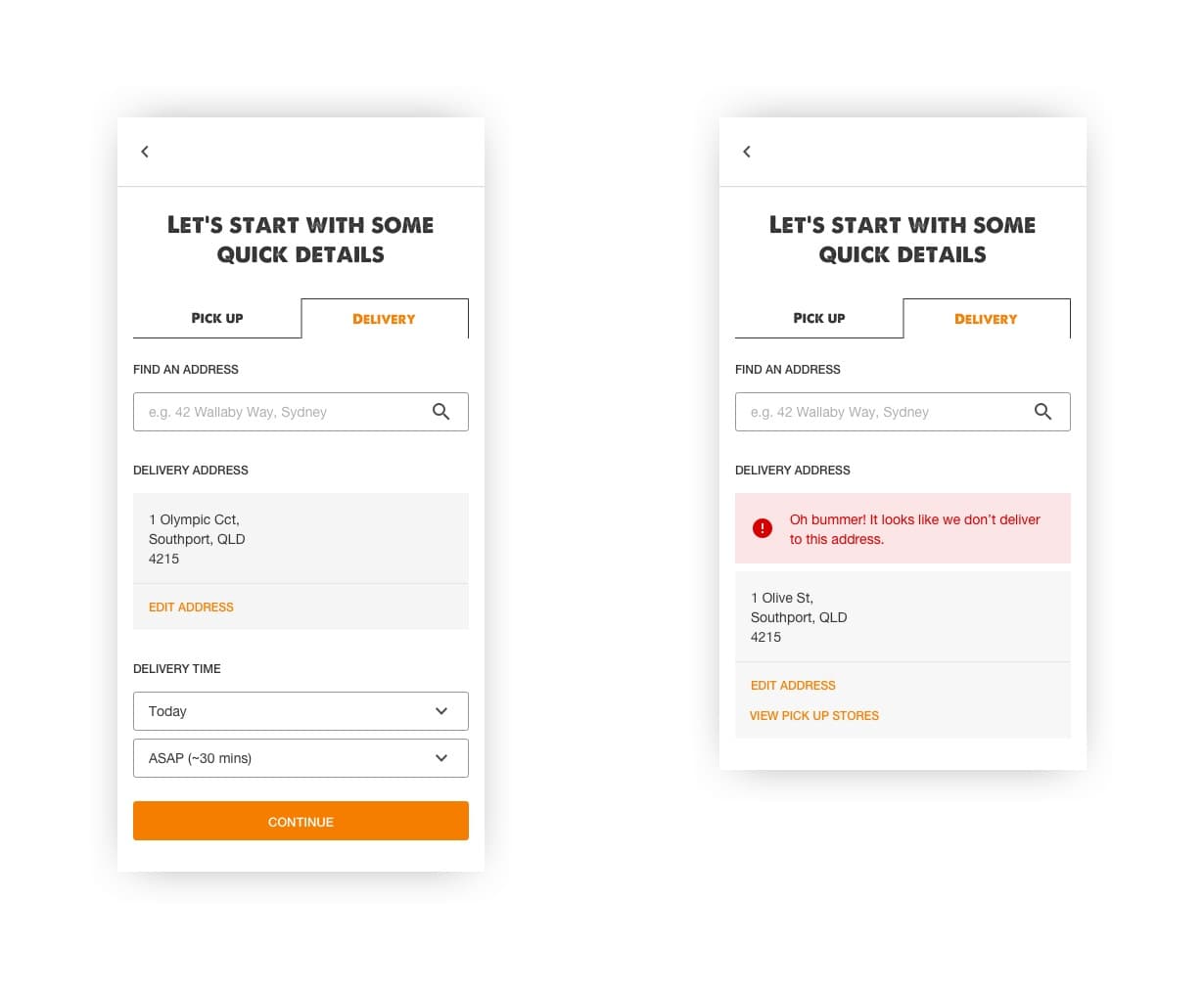
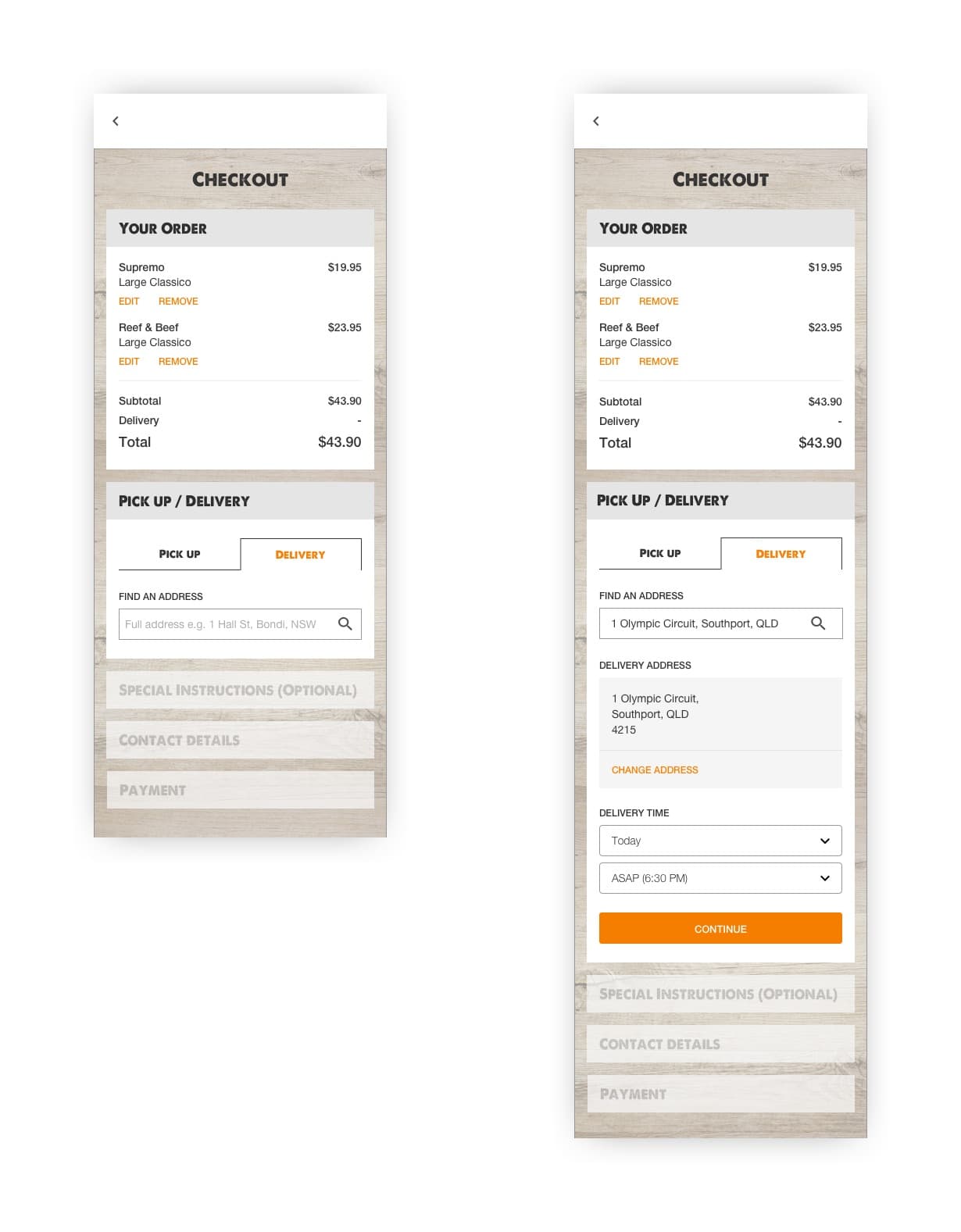
Fulfilment details — pickup location, delivery address, time — were collected at the end of the process. A customer could spend ten minutes building an order only to find their local store was closed at checkout. It also made variable pricing impossible for the business.
Fulfilment collection was moved to the start, triggered when the first item is added to the cart, while still allowing users to browse the full menu before committing.
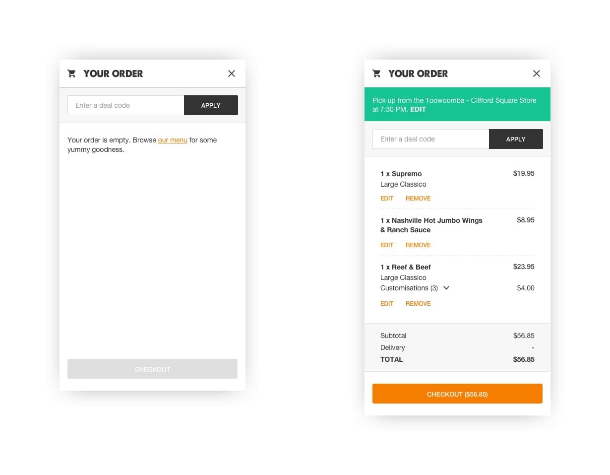
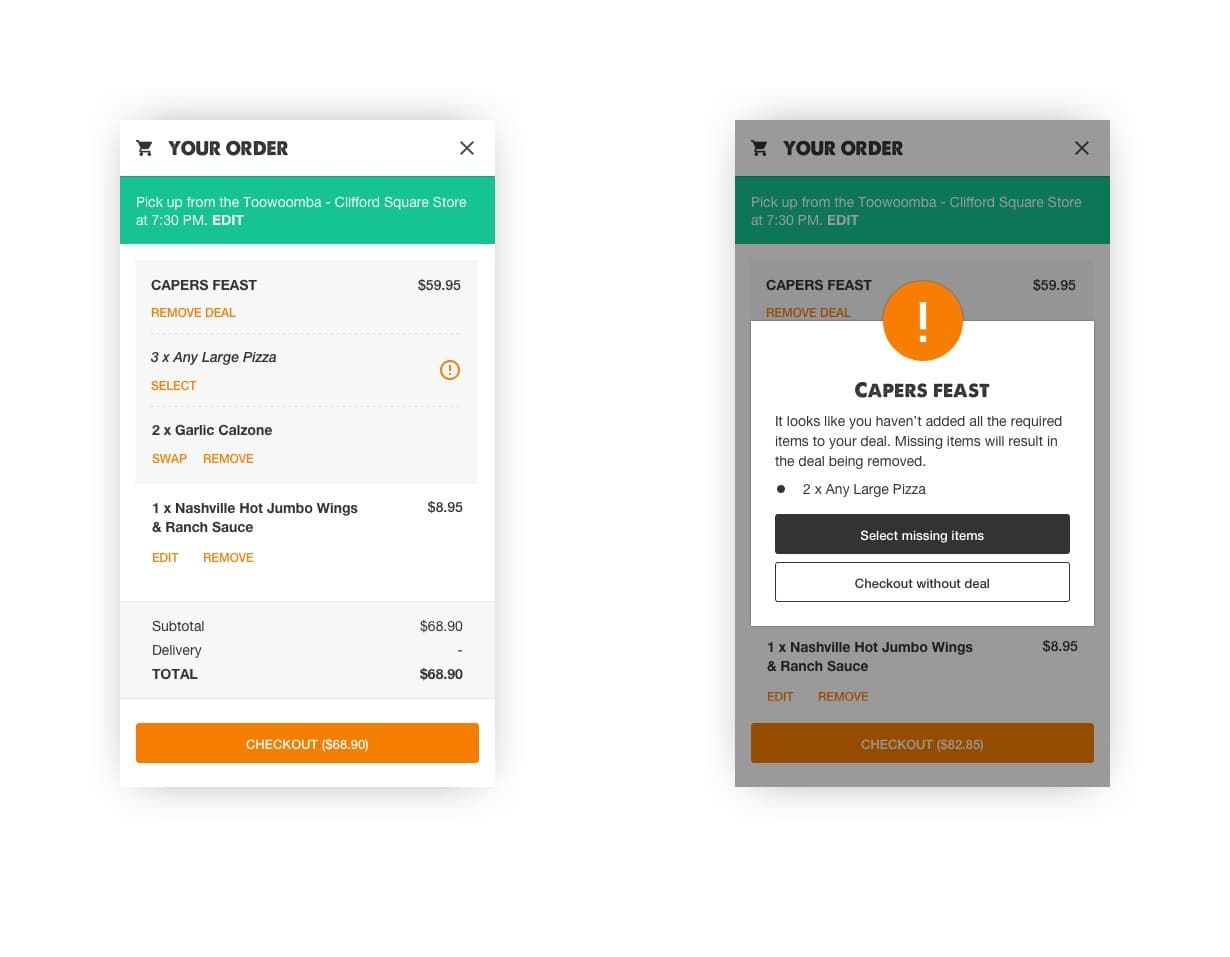
Deal Bundles
Building a deal bundle required customers to read a block of instructions, manually find the right products, and hope they didn't miss anything — an incomplete bundle meant paying full price. The cart was redesigned so an interactive bundle was added automatically, with qualifying items listed, defaults pre-populated, and a validation step before checkout.
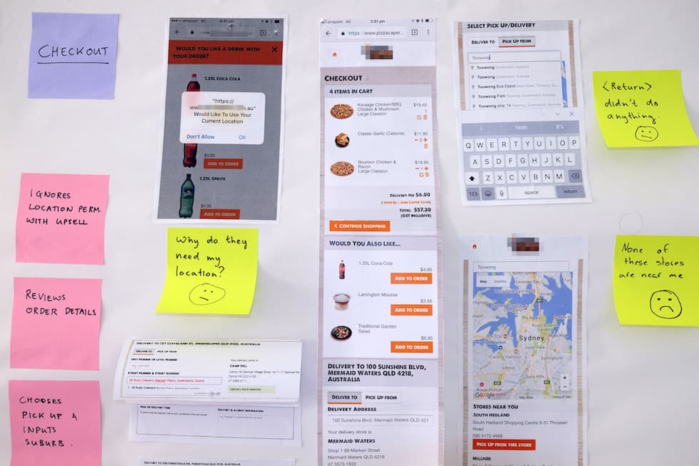
Checkout
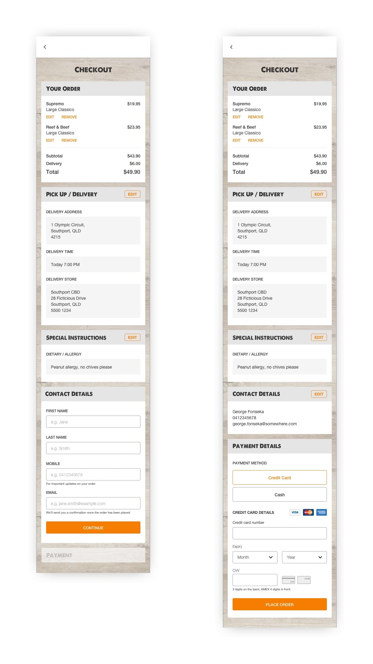
The checkout had too many outbound links causing abandonment, a confusing address input, and end-only validation that left errors until the worst possible moment. The redesign stepped users through one section at a time with inline validation, and stripped back links to keep focus on completing the order.
Validation & Prototyping
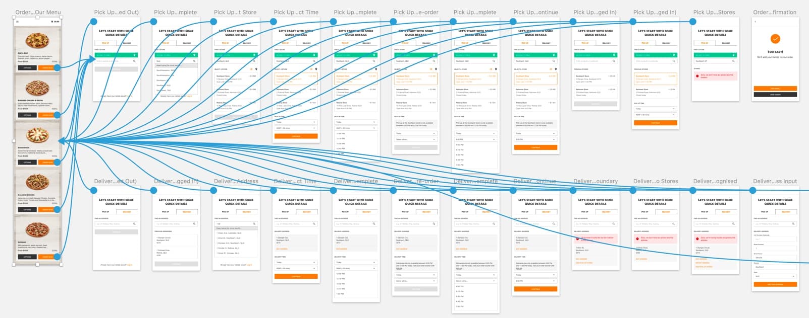
As development was handled externally, prototyping and testing before committing to a build was essential. As someone once said at IDEO, “if a picture is worth a thousand words, a prototype is worth a thousand meetings.”
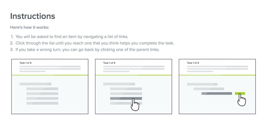
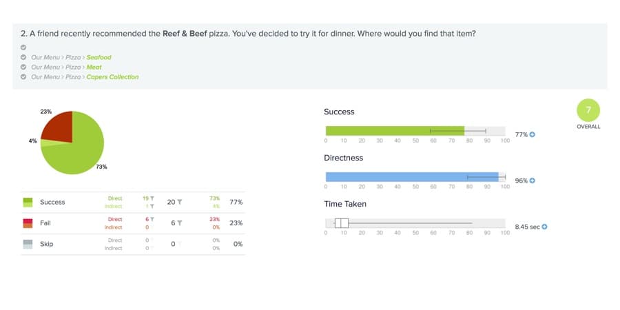
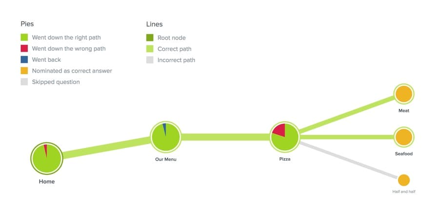
I used Treejack to tree test the proposed navigation structure with ~20 participants, with positive results giving us confidence to proceed. For click-through testing, prototypes were built in Sketch and InVision with a minimum of seven participants per round. Where animation was central to the interaction, I used Principle to prototype more faithfully.
Outcome
Delivered in stages to balance UX improvements against business-as-usual development, the project produced an 8% increase in online conversion and a meaningful reduction in customer complaints — with the remaining enhancements queued for delivery.
The project reinforced how much UX work in constrained environments is about influence as much as craft. Journey maps became the bridge between research and stakeholder buy-in, and iterative prototyping kept momentum going when resources were tight. Sometimes the biggest design challenge isn't the interface — it's getting the right people to care about improving it.